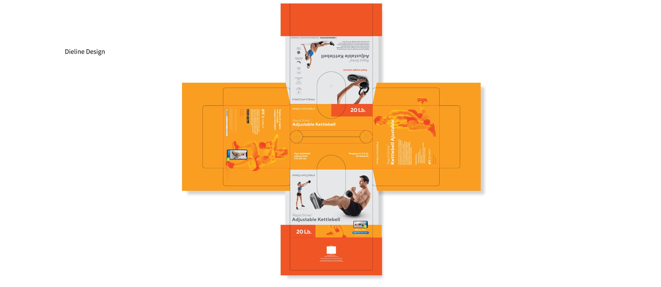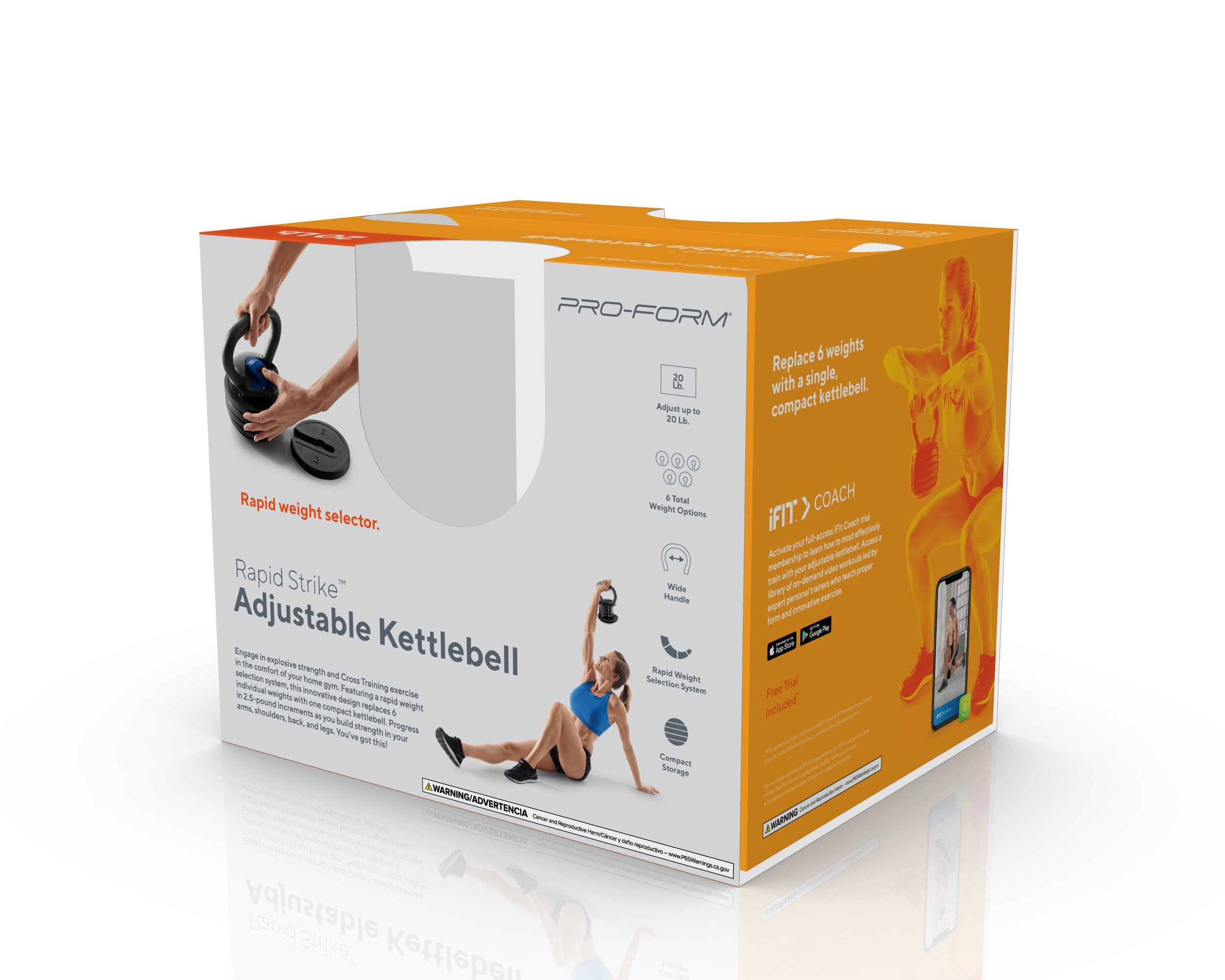
PRO-FORM
PRO-FORM was preparing a refreshed retail presence for a new generation of home fitness products. I joined ICON Health & Fitness to develop packaging concepts that could push the brand forward while still feeling recognizable within an established product ecosystem.
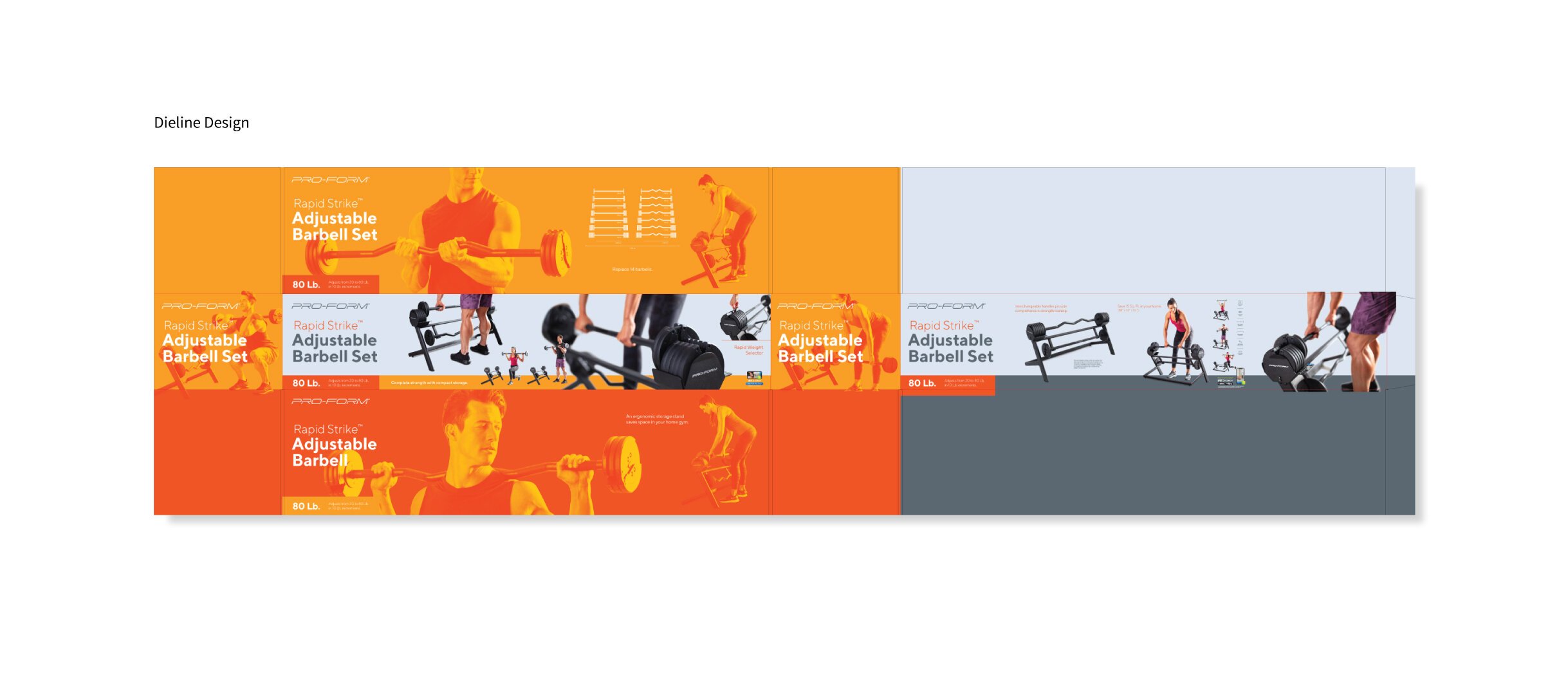
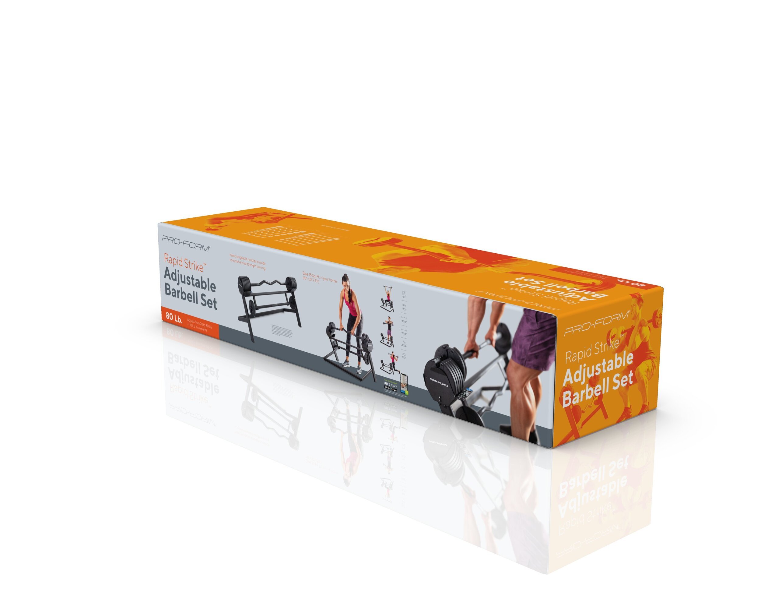
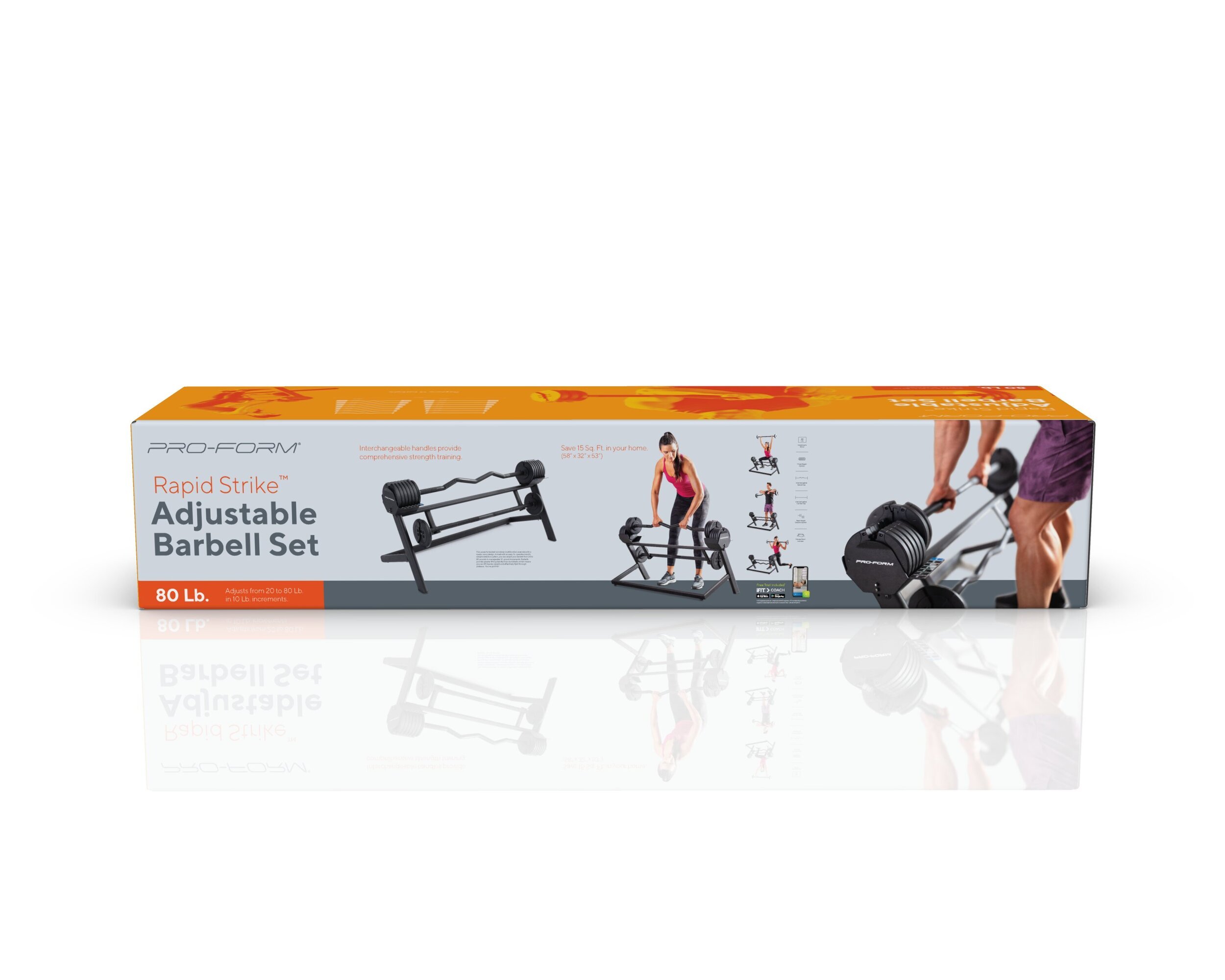
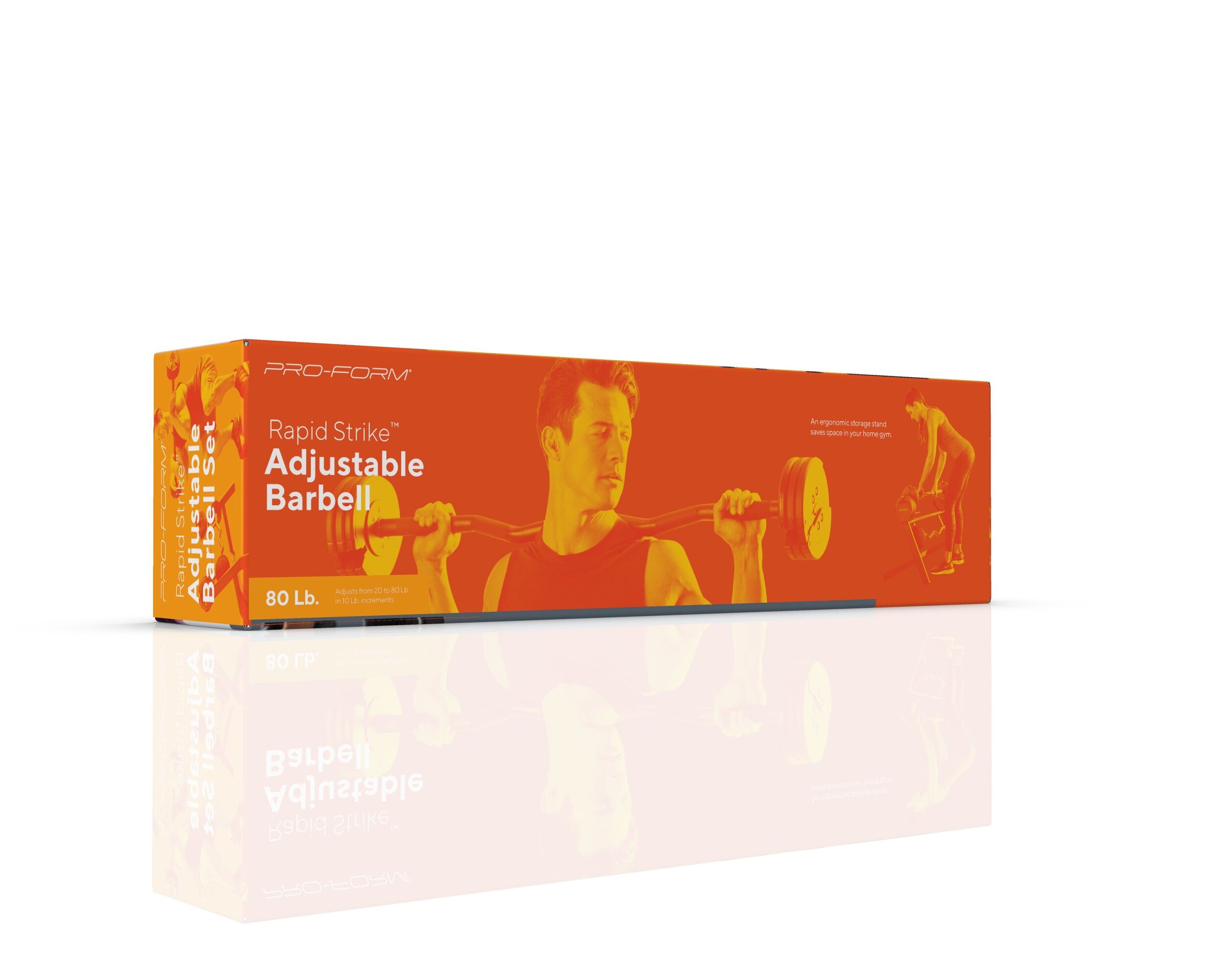
My role focused on translating that direction into retail: exploring color, product imagery, hierarchy and feature communication to create a stronger, more cohesive presence on shelf.
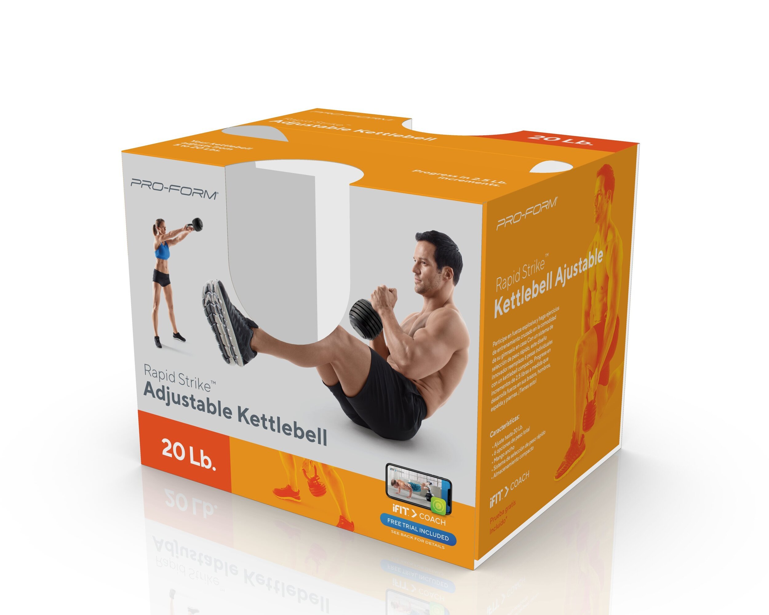
In a crowded retail environment, the packaging needed to communicate quickly. Product type, key features, weight and iFIT integration all had to be immediately understandable while giving PRO-FORM enough visual distinction to stand apart from neighboring fitness products.
I explored a brighter, more graphic packaging direction using bold color fields, simplified hierarchy and large product imagery to give the line more energy and visibility without losing its functional credibility.
Built for the Shelf