
GOPRO
I currently design on the Brand Ops team at GoPro. As the leading action-cam company in the world, my team never sleeps. Most of my day-to-day missions include design for global in-store retail experiences and for digital retail, B2B marketing materials, and OOH advertisement (billboards, plasters, etc.)
DESIGN BREAKDOWN 01
Amazon A+ Content
-
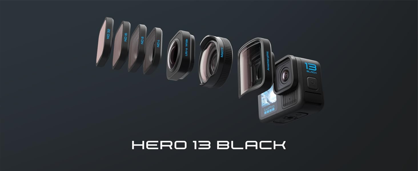
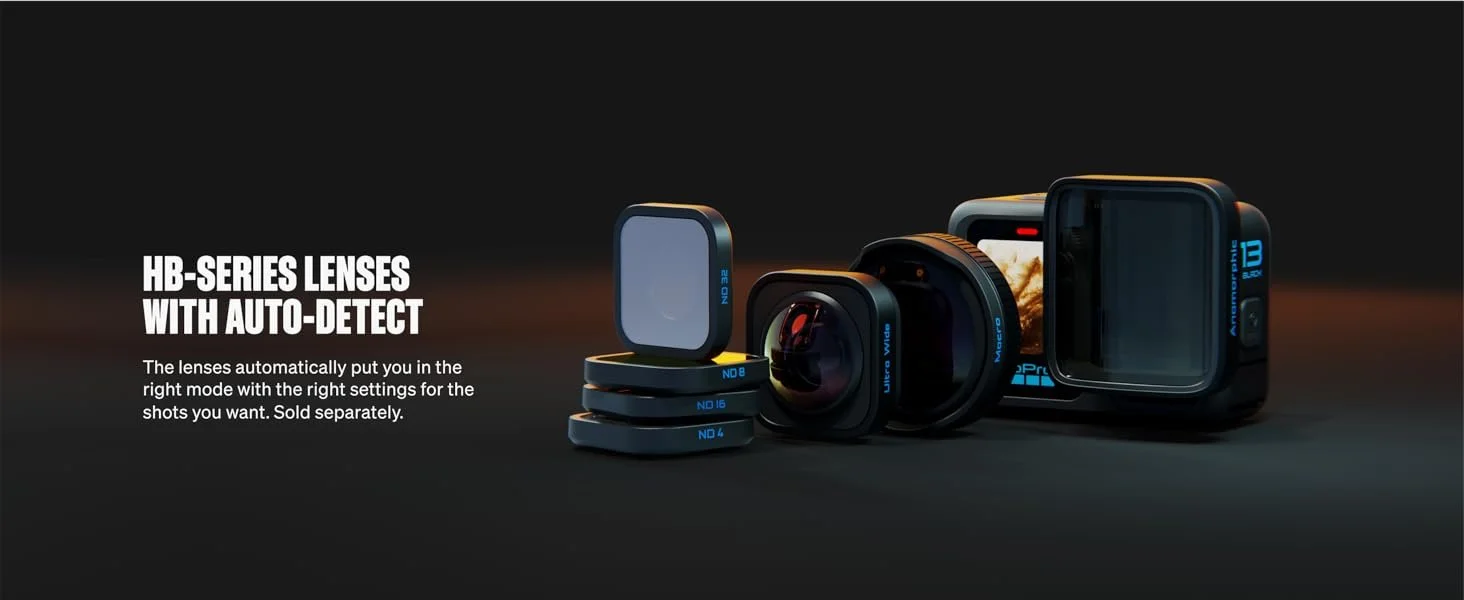
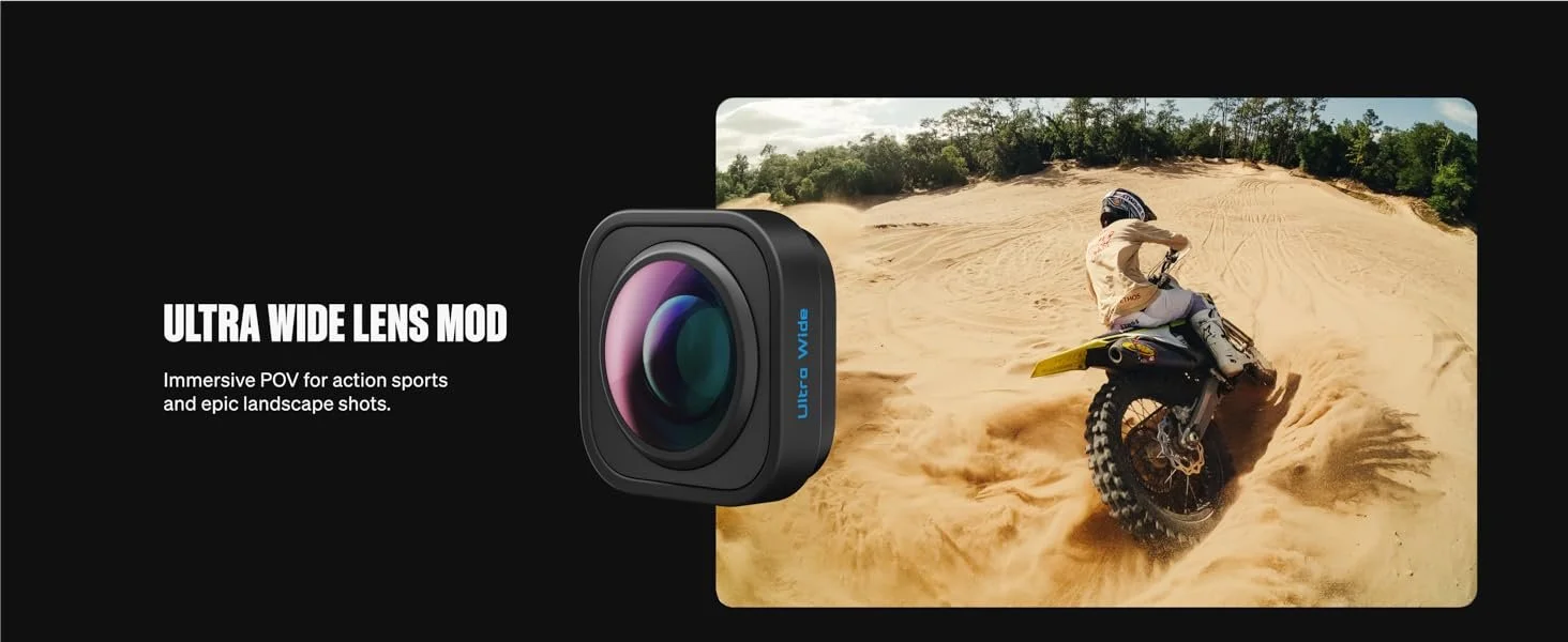
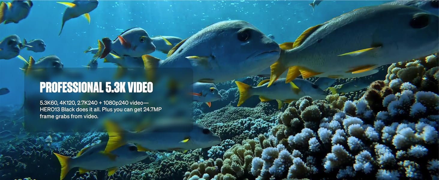
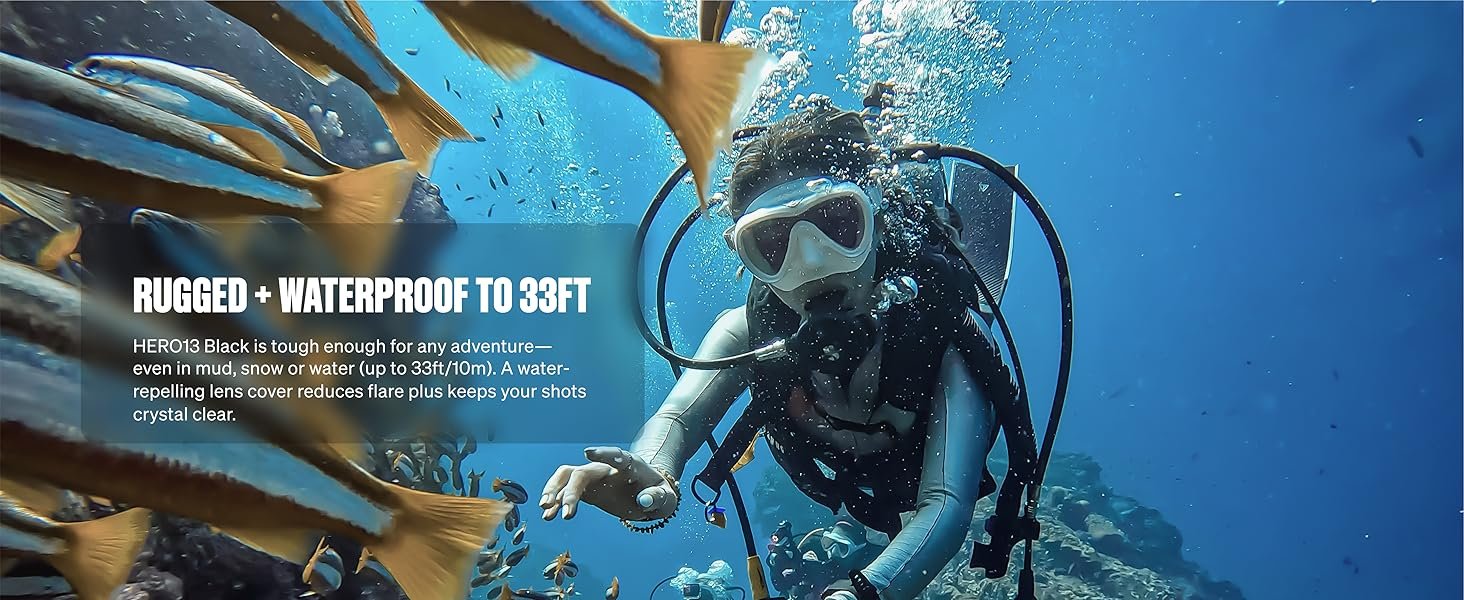
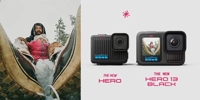
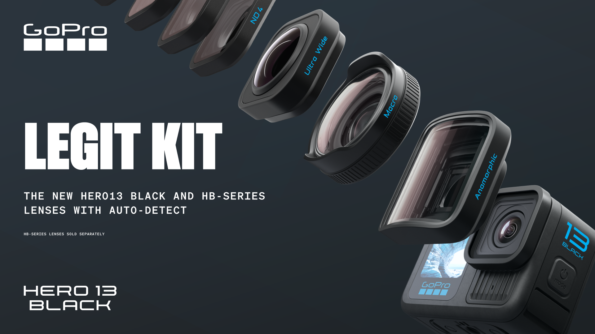
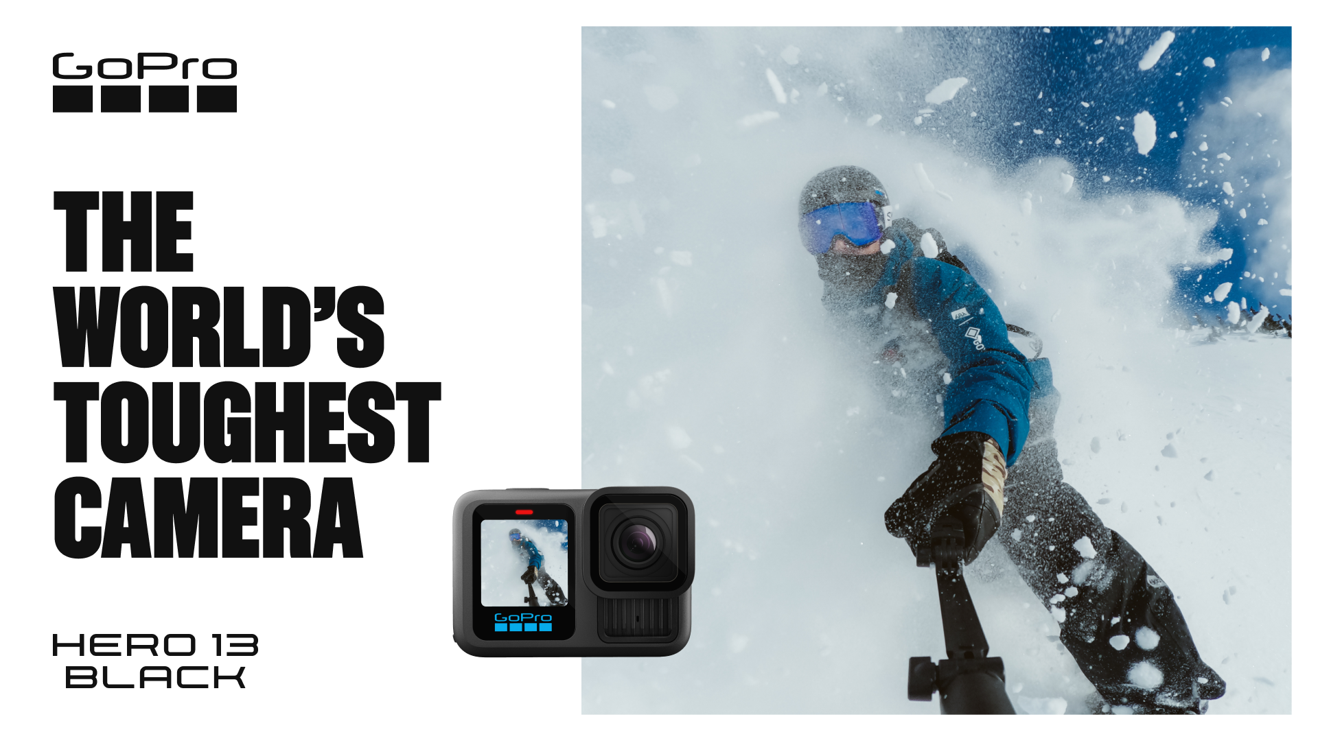
Being tasked with designing the Amazon Premium A+ content for our new HERO13 Black camera page was exciting and a little daunting. Through a delicate dance with the copy team, photography team, 3D render team, and my art directors, I pulled together a unique sale funnel that is fun to look at and pushes the magic of our new flagship camera.
-
Shoppers on the biggest e-commerce platform on the planet, itching to get their paws on the latest flagship camera from GoPro.
Optimized with Flare
Amazon Premium A+ pages are always a tricky task. We have a very strict layout with only a few tools at our disposal to differentiate our page from the rest of the noise on Amazon. This design specifically uses a set of carousel layouts that we cleverly transformed into a smooth viewing experience that doesn’t feel like there’s a restrictive design system on top.
Future-Proof
GoPro likes to really lean into new aesthetic directions for each new camera launch. While that’s always important to breathe life into new campaigns, it was key to reign back a little bit syalistically so the Amazon content can live thrpough many seasons while maintaining a cohesive look throughout the next few years.


DESIGN BREAKDOWN 02
Global Retail
-
A lot of my juice is spent on global retail pushes for new camera launches. The examples below are of in-store graphics and online ads.
The objective is to stop customers in their tracks and push them toward buying a GoPro. Classic!
-
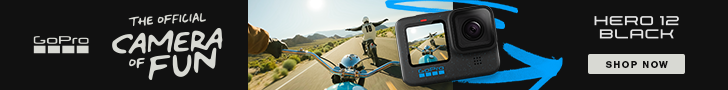
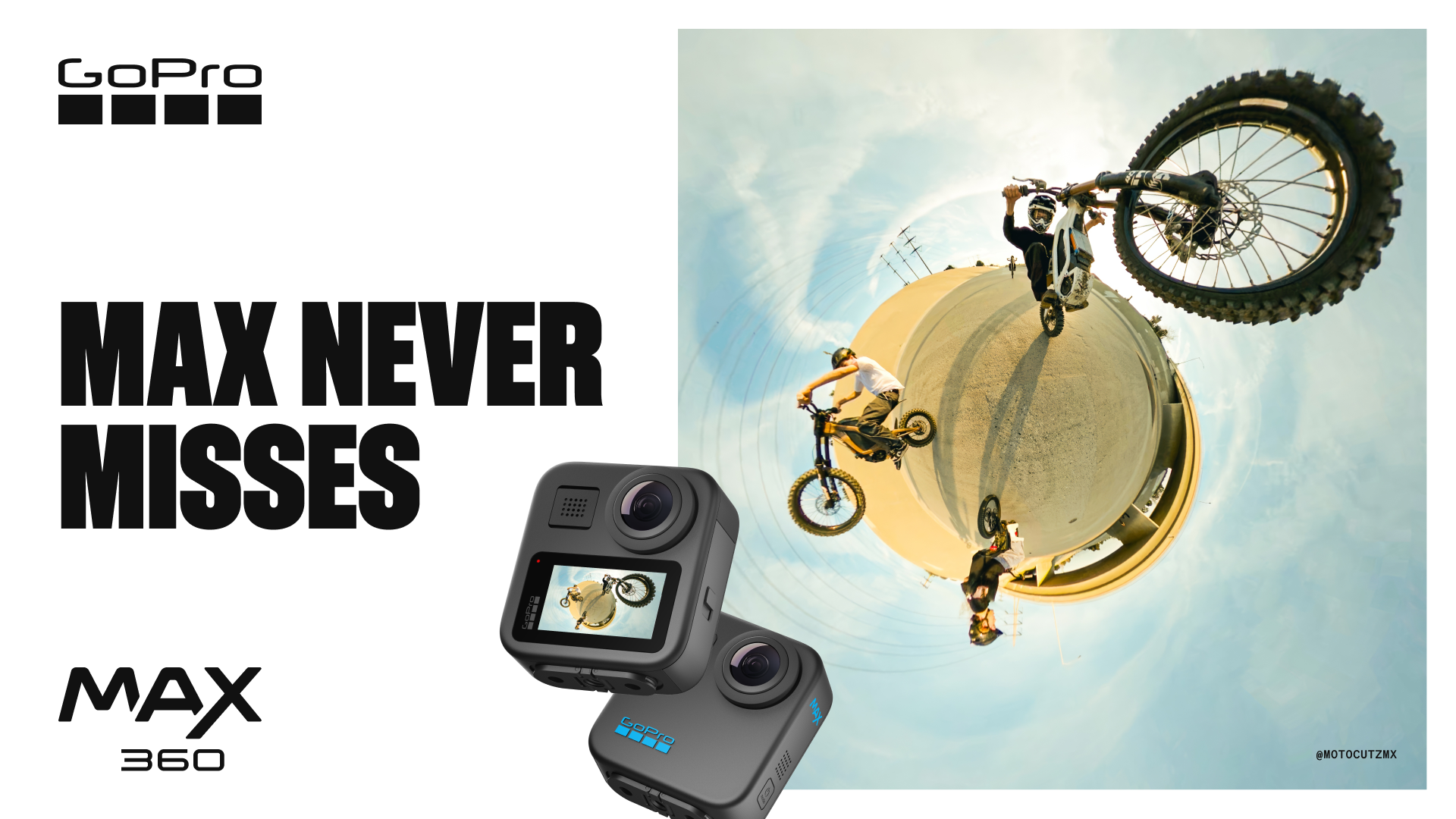
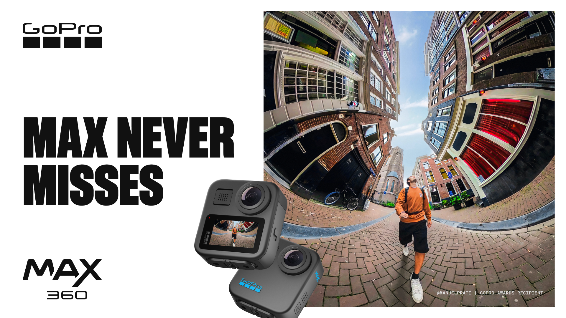
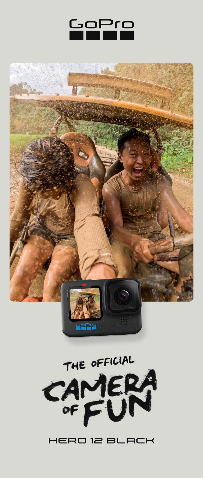
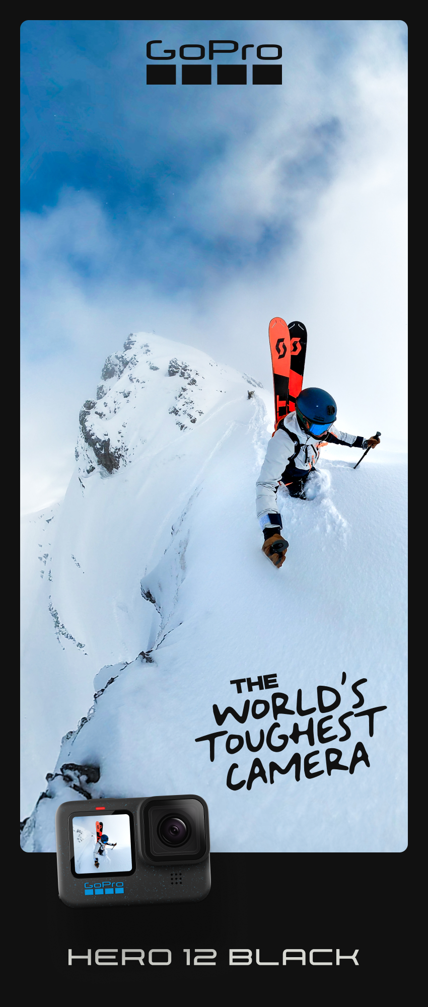
Our latest camera launch, the HERO12, had a retail push for "The Official Camera of Fun" or internally "OCOF". Typically GoPro uses epic imagery of athletes defying gravity and pushing the human limits. In contrast, we wanted to cater to the masses and not just the athletes. This is the mom that goes sledding with her kids, the fly fisherman on a lazy sunday, the festival goer at a Phish concert. The imagery and copy reflected this approach.
In-Person + Online
Below are some examples of graphics that would either be printed for a store, or exported for a digital retail space.

Catered
Even though we have dozens of retail ads around the globe, we slow down and customize each and every advert to tell a story that’s catered to a specific crowd. This Del Amo example is for a motocross market that values badass boys on bikes.
Tidy Files
Me and my team run a very tight ship with file management and cross-platform communication with inward and outward teams to ensure our vision is implemented without a hitch.


Website Banners


YouTube Thumbnails

DESIGN BREAKDOWN 03
Sell Sheets
-
A lot of my time is split with the more technical design inclusing sell sheets translated and sent to global retailers to train their staff on product info and features.
-
Retail owners and their employees. These sheets are translated into 20 different languages.


DESIGN BREAKDOWN 04
Custom Logo
-
This was a cool departure from my usual projects. The brand team asked that I cooked up a custom logo for the upcoming podcast series GoPro is launching soon. The goal was to create something timeless that felt GoPro while also feeling special and brandeable in it’s own right.
-
Lovers of that sweet audible gold and a tinkering for wicked GoPro stories from around the globe.


